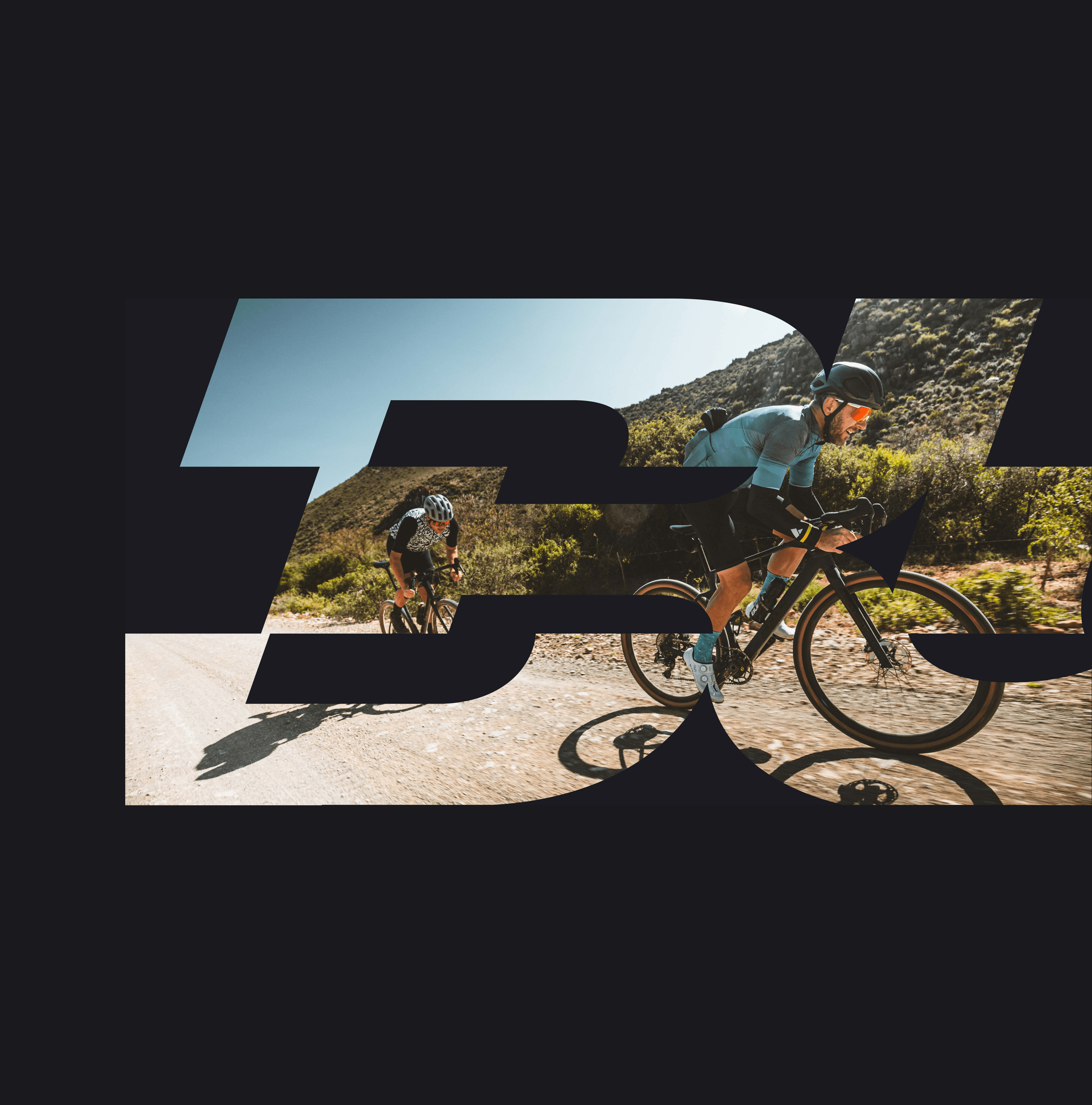
Built for race day
Designing the complete digital experience of Nedbank Gravel Burn, from app to web

Role
Lead designer

TIMELINE
Aug-Oct 2025
TEAM
2 designers, 2 devs, 1 product manager
SKILLS
App design
WEB design
What I did
I led the digital design of Nedbank Gravel Burn alongside one other designer, taking the race from almost zero digital presence to a fully realised experience across app (for riders) and web (for fans).
How I did it
I conducted stakeholder/user interviews and a competitor analysis to understand what the best race experiences in the world were doing, and how we could differentiate.
I owned the full design process, from information architecture and wireframes through to prototypes, QA and launch support.
With no existing digital brand to work from, I built the entire visual world from the ground up, translating the spirit of the race into a cohesive digital identity.
What riders said
Payson McElveen, the top exclusive gravel-focused Red Bull mens athlete, recorded a podcast after every stage. The digital experience was praised.
TABLE OF CONTENTS


Building a website for an audience that can’t be there in person.
INTRODUCTION
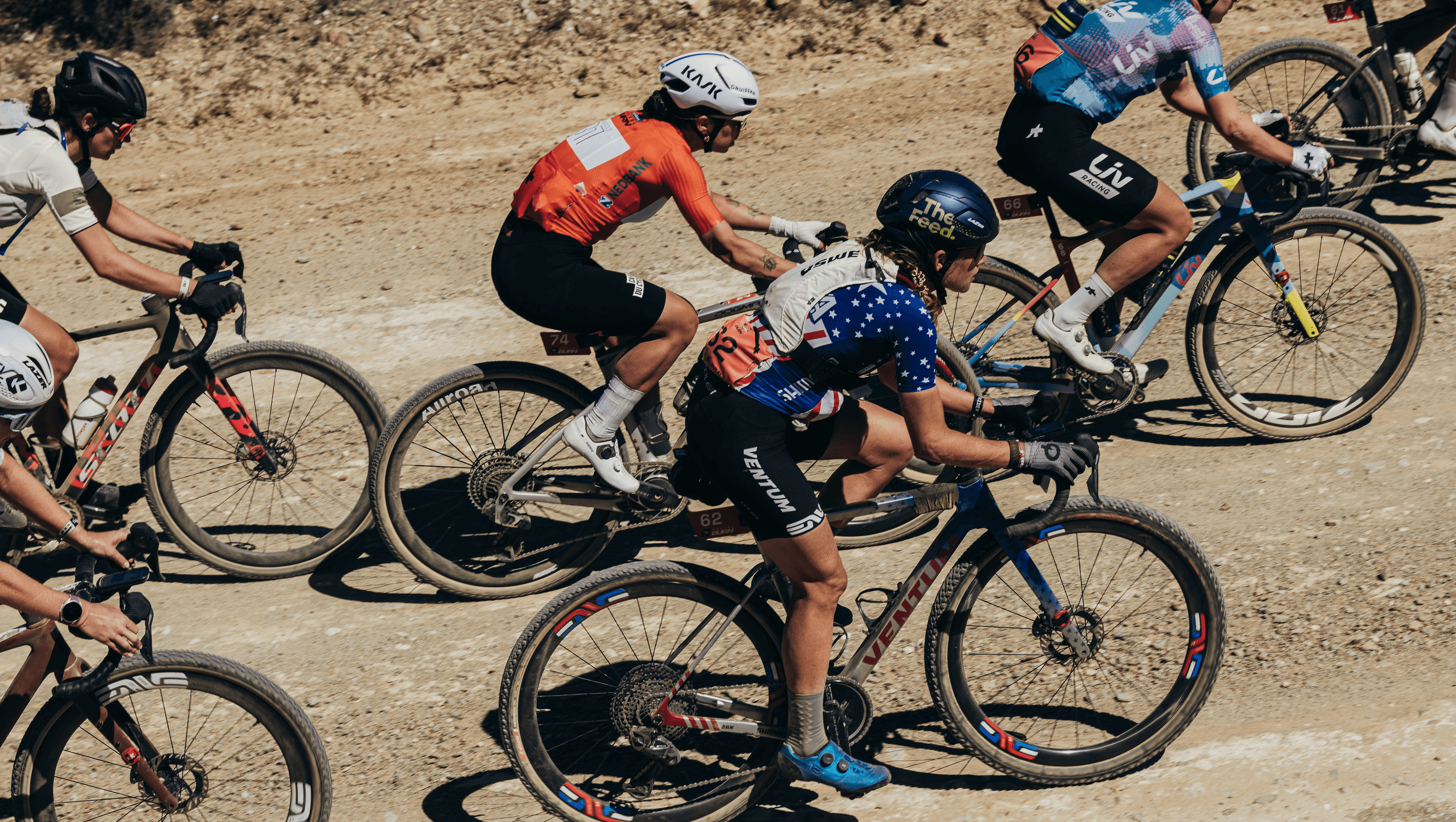
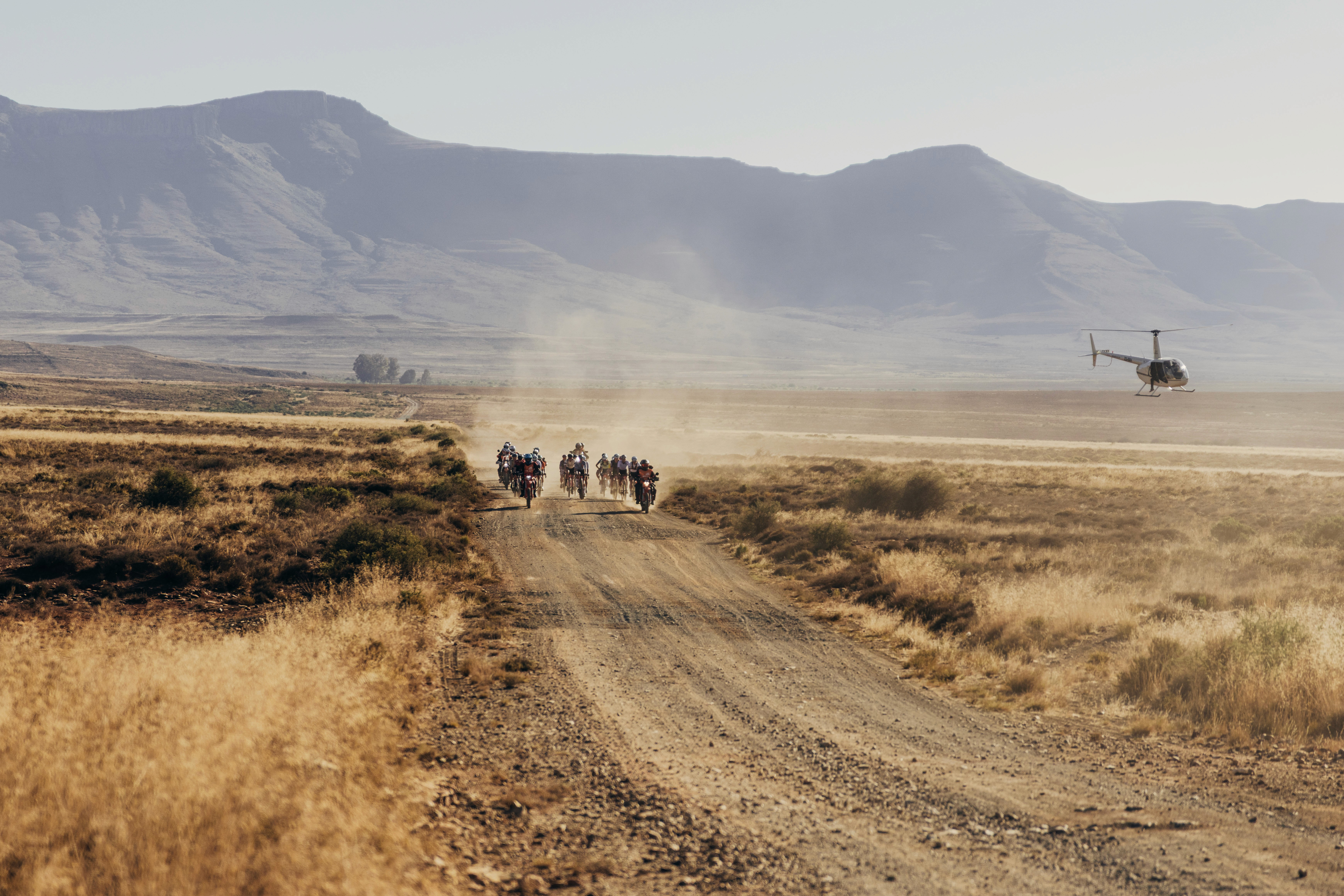
Nedbank Gravel Burn’s home ground is The Great Karoo, also known as 400,000km of sun-scorched, arid terrain.
Uniquely, due to the conditions of the road, no spectators are allowed.
CHALLENGE
Racing deep into the wilderness is Gravel Burn's selling point, but it had no digital infrastructure to support that
This was the first race of it's kind. The NGB team needed to deliver live updates of the race to viewers worldwide, from a wild landmass that has close to no signal. With athletes largely cut off during the race, and no on-site spectators allowed in these remote locations, the digital experience on web was the only thread connecting riders to the people cheering them on from thousands of miles away.


Designing and building the thrill of "being there"
#1
Building emotional connection with every visit
Photography and videography was designed to take centre stage. Wide shots of endless desert plains, close-ups of grit-covered faces mid-effort, drone footage sweeping over the raw immensity of the Karoo. Every frame was chosen to pull the viewer in and make them feel the weight of what these athletes were enduring.
To keep the experience alive across the full duration of the race, I worked with the engineering team to also custom-built a backend CMS that gave the client complete editorial control. They were able to upload daily highlight clips, news, and photography instantly, without technical barriers. The story could be updated as it unfolded, keeping fans and media connected to the action in real time.


#1
Bridging the physical and digital worlds
Orange was the language of the athlete. In the physical world, orange blazed across jerseys, race numbers, and merchandise, a streak of colour against the pale plains.
The online world was a mirror. Orange characterised rider profiles, athlete content, news stories. Card shapes were inspired by cycling pelotons, mirroring the way orange jerseys overlap and shuffle past one another in a paceline. Those cards became collectible - each one a rider profile packed with fun facts, hobbies, and pre-race rituals.
Green was the language of the route. In person, and on TV race coverage, it green was visible in the route signage, in Nedbank's signature shade. Not to mention it's appearance in nature, in the forests and scrubland.
Online, green became shorthand for course intelligence. Stage selectors, elevation maps, terrain overlays, all in the same deep, Nedbank green. From a user experience perspective, this created a visual thread between the physical route and its digital representation. Whether you were riding it or studying it, green told you where you were. For those at home, it translated the weight of 786km and 11,894m of climbing into something you could feel on screen.


#3
Transforming raw data into a heart-racing story
How do you make milliseconds matter to someone watching from a sofa in London, Sydney, New York or Cape Town?
I transformed raw data so that it told the story of the race. Leaderboard shifts, stage progress, real-time rider positions shown live. Animated terrain profiles updated as riders advanced through the course, giving fans a visceral sense of the ground being covered and the effort it demanded.
Every element was built with mobile at the front of mind, optimised for smooth performance even on the patchy connection of the Karoo.

Curious for more?
This is a limited case study. Please reach out for more details.
Surface. Say hi. Get in touch.

Internet Surfing
Internet Surfing

Internet Surfing